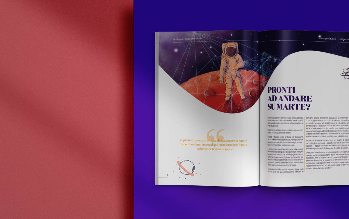
Ready to go to Mars?
We have been working on it forever and a day. We like to think that we have accomplished something.
There we go, our new brand, a long work done on our brand identity finally comes to an end.
This renewed focus reflects the fact that we are an organization driven by Purpose and Mission and with a clear Vision .
Re branding embraces a wide range of aspects, from how we talk to our visual world. Through our culture and excellence in technology, we distinguish ourselves from our peers.
I’ll walk you through a short discovery tour.
Let’s start!
Why change your logo?
From old to new
Nothing is lost, nothing is created, everything is transformed
–Antoine-Laurent Lavoisier
Changing logo has meant raising our awareness, it has meant daring to define ourselves by demonstrating who we are. Moving away from what does not sufficiently represent us, sticking to the core values and principles that align with our path. A unique and distinct identity, capable of reflecting our basic pillars: man and technology.
New Identity
Getting into the tour, I will show you how we have interpreted these two pillars.
Human
The logo font type is graceful – that could seem to be upstream in the Tech context. Are you seriously thinking we are noobs? 😉
The choice has been carefully weighed up, considering that all graceful fonts have a major characteristic in common: they are human in the sense that their shape dates back to the time when fonts were used to reproduce handmade writing.
Once we are done with the first pillar, this is how the second pillar came in.
This is why I am getting you into the time machine.
Can you recall when CSS was not used and links were simply underlined?
That is why in the extended version, the logo is underlined in red. It is a straight reference to digital.
We have translated the same notion into the symbol.
Perhaps saying that the fil rouge is red sounds a bit weird, but that is so! The “linear” element remains, but vertically the link identifies another distinctive feature: the cursor, which extends the idea of writing to codes.
New strength to Payoff
Being proactive, having an outlined vision and writing it, is an integral part of our corporate identity and culture.
At last, our payoff Coding the Future has taken its deserved front-row space. It appears under the extended logo carving out its own space as a key protagonist in the symbol, succeeding in the intent to strongly condense Interlogica’s philosophy.
Colors from distant worlds
Colours reflect our true soul. A range of bright and positive nuances, stolen directly from space, from distant planets, not yet reached.
Energy, innovation, breakthrough. Colour reflects our hunger for knowledge.

Meaningful illustrations
Space imagery takes shape in a number of different forms and notions that through original illustrations help us turn the most complex themes and cross cutting ideas into something intuitive and poetical.
Storytelling
As the payoff takes us on a fantastic journey into the future, storytelling through references and figures, emphasizes the direction.
Planets, universes, spaces…that is what we are increasingly ‘conquering’ (for better or for worse).
NASA, space shuttles, Space X, are not ringing any bells?
Faraway worlds, from a future now more than ever give us the thrust power to be innovative and see what others cannot clearly see. The future is already here and it is an opportunity to be seized and to be mapped through Technology, Passion, People, and Skills.
DOWNLOAD INTERLOGICA BRAND PACK
Coding the Future
I’ll tell you right off the bat, we didn’t use an external agency to create the new brand.
This is because we have worked a lot on Interlogica’s path starting from Purpose, Mission and Vision, as a team, with agile processes, reflecting on what we had learned along the way to evolve and make a difference. It is a new landing and we are all set for a new departure. The change is remarkable, I know, but it is a bridge between the past and the future. A different look, but it doesn’t change the commitment, creativity, and professionalism with which we meet all challenges
We are not merely talking about appearance. We are addressing opportunities, possibilities, and paths to be taken to bring true life and fill with meaning what at first glance may seem to be just a set of signs.
Want to learn more?
Company Purpose: why we need it now more than ever
How can Mission and Vision be defined? Our Journey